Thursday, June 7, 2012
Stop Motion Final
This is me and Ava's stop motion final. To do this we had me lay on a blanket and fan my hair out behind me, then take intermittent pictures while doing designs with my hair. Our theme is hair and creating designs with it. This wasn't too challenging to do, but it was a little hard at times to make sure no hands or body parts ended up in the pictures. This video shows color by using the sharpies and the gems, and we made my hair pop out more by having it on a rich brown background. We also tried to balance me in the center of the photo and I layed there the entire time, to keep the balance consistent so it would be easier to watch.
Tuesday, May 15, 2012
Commerical vs. Artistic
Commercial
Artistic
The top photo is commercial because it's very simple and clean-cut, and Ava looks pretty professional. Its not a very personal photo and looks like it could be used to sell art. The bottom photo is artistic because it shows Ava's personality since she's a dancer. Its very personal and much more insightful, and you couldn't really see it selling anything. It's more expressive.
Friday, April 27, 2012
Best of Portrait Assignment
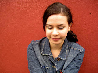
I think my most successful portrait is the top one of Ava. I used rule of thirds to make sure I wasn't putting her right in the center of the photo, and I think having it a little off center makes it easier to look at. I shot at about her level, but standing a little above her so it would be a flattering angle. I think the red background works well because its simple but vibrant, so it makes her stand out from the background while still keeping her the main subject. I edited the saturation and blacks in Lightroom to bring out the red in the background and make the shadows on her and her hair stand out more.
Friday, April 6, 2012
Best of Light, Shadow, Reflection
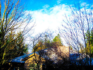
This is my best example of backlighting - silhouette. I think the way the lighting made all the foreground black really adds a 'nighttime' feel to the picture and also really emphasizes the shapes of the trees and house.
This is my best example of backlighting - subject lit up. The light of the lamp frames the shape of the earrings really well and the light also draws more attention to the details in the earrings (like the yarn). It works like a halo around the subject.
This is my best example of chiaroscuro. The way the lighting is really intense on his face and background and only lit up underneath the basketball makes the photo very dramatic and much more interesting than it otherwise would be.
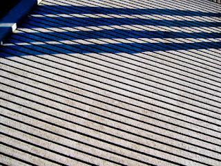
This is my best example of shadows as subject. I really like how the horizontal lines and the vertical lines of the shadows contrast with each other.
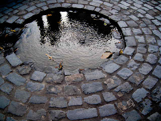
This is my best example of reflections as subject. The way the light hits the water well really draws your eyes line, and i like how it looks like silhouettes in the water.
Tuesday, March 20, 2012
Photo Effects
This is my example of a daguerrotype. A daguerrotype is a photograph taken by an early process employing an iodine-sensitized silvered plate and mercury vapor.
Tuesday, March 6, 2012
Multiple Image Techniques
This is my favorite example of multiple exposures. I took a picture of a plant and a picture of my deck and layered the two over eachother.
This is my example of a panorama. I took this picture down by Fox Towers by taking multiple pictures of this scene as I panned my camera across, and then combining them in photoshop.
This is my example of a panorama. I took this picture down by Fox Towers by taking multiple pictures of this scene as I panned my camera across, and then combining them in photoshop.
This is my example of using HDR. I took an overexposed, underexposed and regularly exposed photo of my backyard and then combined them in photoshop.
Friday, March 2, 2012
Best of Motion Assignment
This is my favorite picture showing camera shake. Its a picture of the fountain and plants at pioneer place. To get this photo, I got down at eye level with the fountain and shook my camera from side to side as I was taking the photo. I think this is the strongest example of camera shake because of the blurred lines it created when taking the picture, which makes it more dynamic.
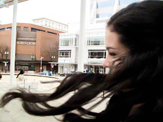
This is my best example of freeze action. To get this photo, I had Ava turn from side to side and flip her hair around while I took the picture. I think this is my strongest example of freeze action because i like how her hair creates a sort of frame for the rest of the picture, and it follows rules of thirds well.
This is my best example of freeze action. To get this photo, I had Ava turn from side to side and flip her hair around while I took the picture. I think this is my strongest example of freeze action because i like how her hair creates a sort of frame for the rest of the picture, and it follows rules of thirds well.
This is my favorite picture showing panning. To get this picture of the biker, I moved the camera with the biker as they were moving, to capture their motion as well as the background. I like this picture the best because of the element of abstractness you first see, and it how it looks a little like a painting at first glance.
This is my best example of really slow shutter speed. To take this picture I set my camera on a tripod outside at night and took a picture of my brother walking back and forth across the driveway with a shutter speed of about 8 seconds. I like this one the most because of how it captured his feet in different positions as he was walking, and how they stand out against the driveway.
Thursday, January 26, 2012
Definitions for Balance Assignment
Organic Shape: Things pertaining to living organisms or something from the natural world. In art, organic shapes are derived from natural forms.
Geometric Shape: regular shapes most often found in human-made objects, machines and architecture. Circles, ovals, squares, rectangles, and triangles are common geometric shapes.
Symmetrical Balance: The near or exact matching of left and right sides of a three-dimensional form or a two-dimensional composition.
Asymmetrical Balance: placement of non-identical forms to either side of a balancing point in such a way that the two sides seem to be of the same visual weight.
Radial Balance: the balance as the result of components that are distributed around a center point or spring out from a central line.
Best of Balance Assignment
This is one of my favorite photos that shows symmetrical balance and geometric shapes. I really like the strong diagonal through the picture that splits it in half, and how the photo is actually balanced. Also the shapes are geometric so they are balanced as well.
This is another of my favorite photos, and it shows asymmetrical balance and organic shapes. I like this photo because it shows balance without having to be symmetrical, and the full shapes of the bushes fills out the picture and makes it balanced.
This is another of my favorite photos, and it shows asymmetrical balance and organic shapes. I like this photo because it shows balance without having to be symmetrical, and the full shapes of the bushes fills out the picture and makes it balanced.
Diptych & Triptych
This is my triptych. I took photos of the sculptures at different angles and zoom views at the park in the Pearl, and then put them together.
This is my diptych. It's a picture of the slats on a bridge and a close up of a bench. I chose these pictures for my diptych because they both have very strong lines and symmetry and the colors and shapes are very similar.
Subscribe to:
Comments (Atom)

