Tuesday, December 13, 2011
Friday, November 4, 2011
Best Photo From Grid Assignment
I think this is my best grid from the grid assignment. I took multiple pictures of light fixtures from different angles, and then played with the exposure to make the background more dark, to provide more of a contrast. I really like the balance of the shapes in this grid, and the symmetry. I think it shows my knowledge of grids well.
Wednesday, October 19, 2011
Paul Strand - Straight Photography
Tuesday, October 11, 2011
Best Photo from Framing Assignment #3
This photo demonstrates diagonals. I chose this photo because i really like the strong diagonals in it, and how the bright green of the trees contrasts with the reddish-brown of the apartments. I also thinks its good how the diagonal goes from one corner to the other, so the photo is balanced.
Best Photo from Framing Assignment #2
This was my photo showing close-up. I think this is one of my better photos because of the detail you can see in the writing on the tree, and how it contrasts with the bright green trunk. I also like how the tree isn't completely centered in the picture, and you can see a little of the background out of focus to give a better sense of how close the picture is. I think it's a fairly interesting photo because of the etchings in the tree.
Best Photo from Framing Assignment #1
This was my square format photo, but it also shows filling the frame. I really like this photo because of the way the peppers fit into a square format: there isn't any blank space and it works well with it. I also like how the only pepper that isn't cut off is in the bottom left corner, almost like rule of thirds and it gives a good balance to the photo. I also like how the colors, how it's varying shades of yellow.
Friday, October 7, 2011
Assignment 1 Slideshow
This is my photo slideshow for our first assignment, which focused on such techniques as framing, leading lines, bug/bird eye view, and diagonals in addition to others.
Tuesday, October 4, 2011
Trent Parke Photography
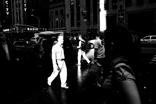
This is a photograph taken by Trent Parke, a street photographer in Australia. I really like this picture because of the contrast between the lady in the foreground and the man in the middle -- it's unique to have that type of contrast / exposure and it really adds more creativity to the photo. I also love city scenes and how the shades of black and white turn an ordinary picture into one that's more interesting. It's really creative to make the man so washed out, so the focus of the photo goes directly to him.
Monday, October 3, 2011
Umberto Verdoliva Photography
This is a picture taken by Umberto Verdoliva, a street photographer in Italy. To me, this picture does a really great job with leading lines - the sides of the street draw your eye straight to the little girl. I also love the balance of the picture, how he photographed it so that the little girl was towards the top and the sites on the street were a little behind her, and then nothing on the bottom. Once again it draws your eye upward to where the heart of the picture is. It's great how this photo has some motion in it as well, because it gives the still photo more life and the sense of a carefree child.
Lara Jade Coton Photography
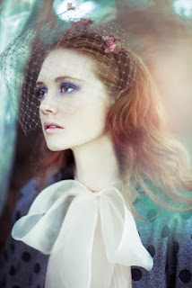
This photo is part of Lara Jade Coton's portfolio, who specializes in fashion photography. I love this picture because of the almost surreal effect it has with the faded out and pastel background which almost seems like mist. It really draws attention to the makeup and outfit the model is wearing, and I really like how she fills the frame - there isn't any space that isn't necessary. Her expression is also really great for the picture, because she isn't looking directly at the camera: it's more interesting.
Friday, September 23, 2011
For our first assignment, we had to take pictures of ourself from different angles, techniques and styles. I like this picture because the lighting is fairly good and I think it's centered well. Some of the pictures that were taken had poor lighting and half of my face was in shadows, but this one is pretty evenly distributed. I also like the background, how it has leaves and the tree trunk and frames the subject (me) well.
Subscribe to:
Comments (Atom)


